If you've ever handed over a beautifully designed logo file, only to receive it back from the printer looking slightly... off, you've run into one of the most common (and most avoidable) headaches in print production. The culprit is usually colour management and, specifically, a lack of Pantone matching.
Here's what Pantone matching actually is, why it exists, and why it matters far more than most brands realise.
The Problem Pantone Was Built To Solve
Every screen renders colour slightly differently. Every printer, every ink batch, and every type of paper stock will also reproduce colour slightly differently. Left unchecked, that means the “brand red” on your website, the red on your business cards, and the red on your packaging could all be noticeably different reds — even though everyone involved thought they were using the same colour.
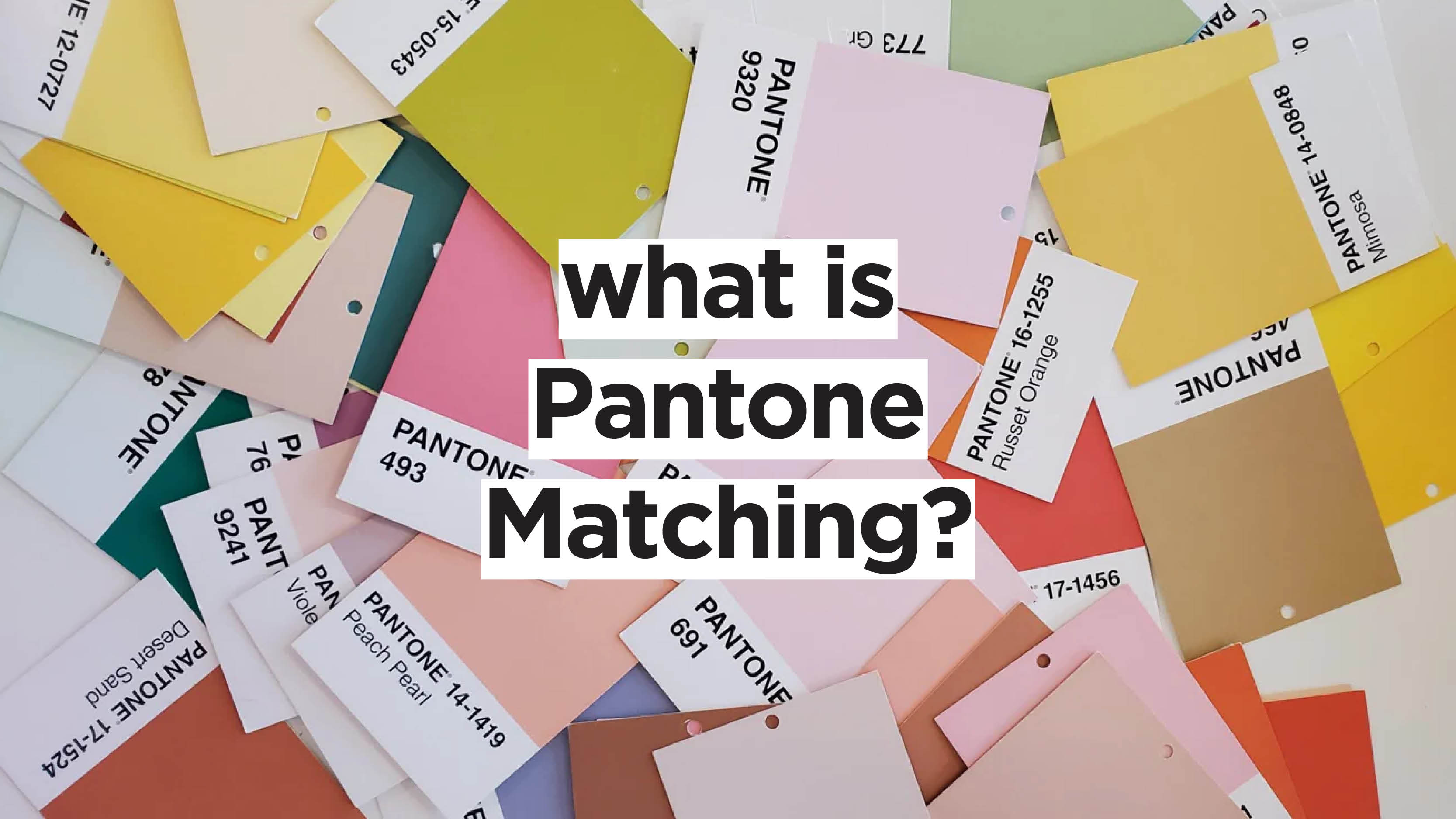
The Pantone Matching System (PMS) solves this by giving colours a universal reference point. Instead of describing a colour as “a warm coral red,” a designer or printer can simply specify Pantone 172 C, and anyone, anywhere in the world with a Pantone book and the right equipment can mix that exact colour, consistently, every time.
How it's different from CMYK and RGB
Most digital design work is built in CMYK (for print) or RGB (for screens). Both are process colour systems: they build colours by mixing a small number of base inks or light values (Cyan, Magenta, Yellow, and Black for CMYK; Red, Green, and Blue for RGB) in different proportions.
Pantone, by contrast, is a spot colour system. Rather than mixing four process inks on press to approximate a shade, a Pantone spot colour is pre-mixed to an exact, standardised formula and printed as a single, solid ink.
This distinction matters because:
- CMYK has a limited colour gamut. Some vibrant colours (bright oranges, deep purples, certain greens) simply can't be accurately reproduced by mixing four process inks. They'll always look duller or shifted. Pantone spot colours can hit shades CMYK physically cannot.
- CMYK is more prone to variation. Because it's built from four separate inks laid down in tiny dots, small shifts in registration, ink density, or press calibration can noticeably change the final colour. A single pre-mixed spot colour is far more stable and repeatable.
- Pantone gives you one universal reference, regardless of the process used to get there. Many Pantone shades also have official CMYK and RGB “translations,” so even when a job has to run in process colour, everyone is working from the same source of truth.
Why Colour Consistency Actually Matters For Your Brand
It's tempting to think of this as a technical detail for designers to worry about, but colour consistency has a direct, measurable impact on brand perception:
- Recognition and trust. Colour is one of the fastest ways customers identify a brand, often before they consciously register a logo or wordmark. If your packaging, your signage, your website, and your marketing materials are all slightly different shades of the same colour, that recognition weakens, and the brand can start to feel less polished or professional.
- Consistency across suppliers. Most brands don't use a single printer for everything. Business cards might come from one supplier, packaging from another, exhibition banners from a third. Without a Pantone reference in your brand guidelines, each of those suppliers is left guessing, and guessing produces drift. A specified Pantone colour means a packaging run in January and a print run in October will match, even if they're produced on completely different equipment.
- Protecting premium positioning. For brands built on quality and craft, colour is part of the experience. A slightly muddy or inconsistent brand colour can quietly undercut a premium positioning, even if the customer can't articulate why something feels “off.”
- Avoiding costly reprints. Catching a colour mismatch after a full run has been printed is an expensive (and frustrating) way to learn this lesson. Specifying Pantone references up front is a cheap form of insurance against reprints, wasted stock, and wasted paper, which matters both financially and from a sustainability standpoint.
What This Means Practically
If you're working on brand guidelines, packaging, or any print project, a few simple habits go a long way:
- Nail down your Pantone references early. Your brand's core colours should have official Pantone numbers documented in your style guide, alongside their CMYK, RGB, and hex equivalents.
- Specify Pantone (not just “the blue from our website”) in every print brief. This removes ambiguity for whoever is producing the job.
- Ask your printer whether a job should run in spot colour or process colour, and understand the trade-offs for your specific project. Some jobs (like photography-heavy pieces) will always need CMYK, while brand-critical elements often benefit from a dedicated spot colour.
- Request a physical proof for colour-critical work, rather than relying on a screen. Monitors are not colour-accurate, and a proof is the only reliable way to confirm what will actually come off press.
The Bottom Line
Pantone matching isn't just a technical formality; it's one of the simplest, most cost-effective ways to maintain the consistency and professionalism of your brand, everywhere it appears. A few minutes spent specifying the right colour references at the start of a project can save significant time, cost, and material waste down the line, which is good for your brand (and good for the planet, too).
If you're planning a print or packaging project and want to make sure your colours are locked in correctly from the start, we're always happy to talk through the best approach for your specific job.