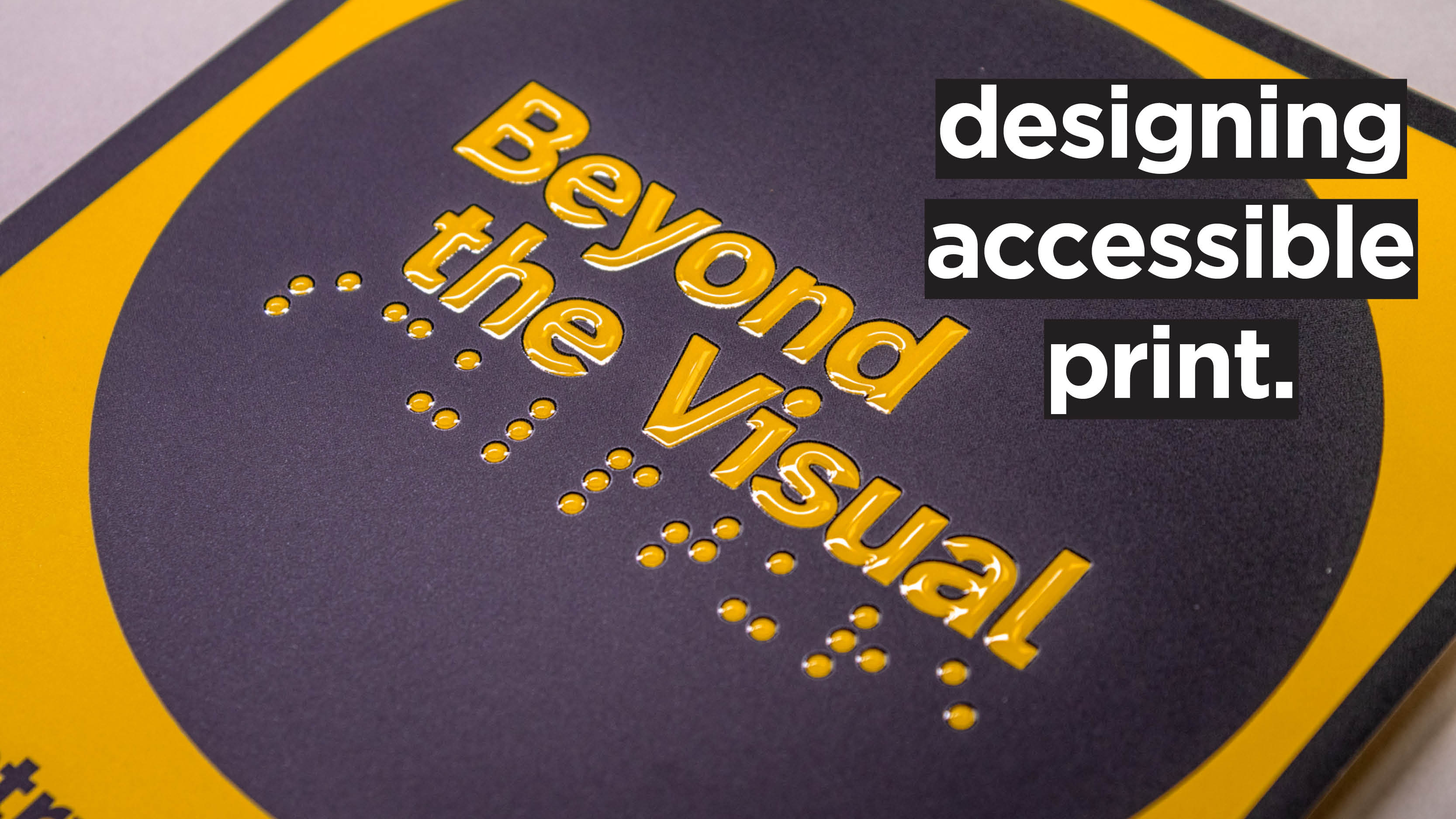
When we think about accessible design, we often think of digital rather than print design. The most prominent accessibility standards, like ICT (Information and Communication Technologies) laws and the international WCAG (Web Content Accessibility Guidelines), refer, as their names suggest, to digital and online content.
Does this mean print is always fully accessible just as it is? Well… no.
Accessibility in print is not only achievable, but something that print designers should strive for.
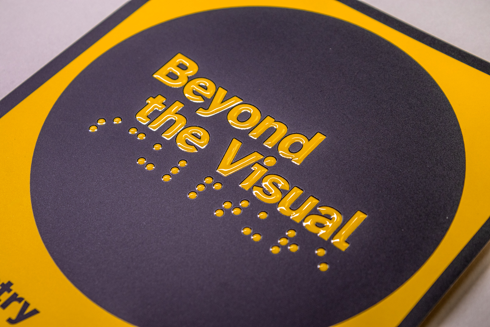
But what makes print accessible (or inaccessible)? And how can creatives design print items with accessibility in mind? By following “clear print” principles.
What Is Clear Print?
Clear print (along with large print) is a design standard used to maximise the legibility of printed documents — maps, labels, brochures, guidebooks, letters, forms…
The clear print standard can be applied to all printed materials; large print, on the other hand, is aimed specifically at people with visual impairments or dyslexia.
Clear Print Principles
Make it bigger: The larger the font, graphic, or table, the easier it will be to read.
Make it clearer: Clear typefaces and straightforward, consistent layouts maximise legibility.
Make it logical: Predictable layouts also make it easier for readers to find the information they’re looking for.
What Makes a Printed Item Accessible?
Now that we’ve covered what clear print is, here is how to implement its principles in your next printed project.
Paper Stocks and Binding
Can paper be… inaccessible? Yes, it can!
Glossy, coated stocks, with their characteristic glare, can make images and text hard to read for visually impaired folks. On the other hand, uncoated paper (especially if off-white or warm white) has virtually no glare, making it much more accessible.
But that’s not all: paper stock thickness can also make a difference. Thicker stock not only reduces the risk of ink bleeding on the other side, but also can withstand more pressure on the page when it’s being turned. This matters for people with mobility issues, reduced range of motion, or who use anything other than their fingers to turn pages.
Lastly, using a binding method that lets the publication lie open flat (instead of needing to be held while reading) can increase accessibility: think PUR, Wire-O, spiral, section-sewn, saddle stitch, or Coptic stitch binding.
Typography
When it comes to accessible typography, there are a few variables to keep in mind.
Familiarity and Legibility
Familiarity helps legibility. This means that typefaces with simple letterforms that are, well, familiar, simple, and without too many embellishments are the easiest to read.
Well-known fonts like Times New Roman and Arial are good examples of familiar, legible typefaces.
Sans serif fonts are usually regarded as easier to read than serif fonts, especially for large amounts of text; however, serif fonts help the eye travel along the line more easily, increasing both readability and reading speed.
Avoid very decorative typefaces like “handwriting” style fonts, thin and black font weights, condensed fonts, underlining, and be conservative when using capitals and italics.
Unambiguous Letters
Each character should have a distinct form that is recognisable and unambiguous from others. For example, the number “1”, the uppercase “i”, and lowercase “l” should all look different.
Letters like “c” and “e” are also quite similar in shape, especially in fonts where the “gaps” in the letters are reduced for aesthetic purposes. To aid accessibility, characters like “c” and “e” should have clear gaps.
Lastly, it’s also important to look at descenders and ascenders (the part of the letterform that falls below and above the line, respectively) in letters like “p” and “b”: make sure that your font of choice has evident descenders and ascenders.
Mirroring Letters
Speaking of “p” and “b”, mirroring letters can be a challenge for people with dyslexia. For example, in Arial, “p” and “q”, and “d” and “b” are mirrored, while they aren’t in Times New Roman.
Kerning
While adjustable in the tracking settings, kerning (the space between each individual character) should be pronounced enough that, for example, letters like “r” and “n” don’t end up looking like an “m” when sitting next to each other.
Font Size
For print, body text should be at least 12pt, or 14pt when possible. That is obviously not always achievable, so we recommend not having type below 9pt.
Colour Contrast
Making sure that all content on a page (text, illustrations, icons, and graphic devices) has enough colour contrast is fundamental for people with sight loss or colour blindness.
Colour contrast is the difference between foreground and background colour, expressed as a ratio like x:y. The first number (x) represents the luminance of the lighter colour, while the second number (y) represents the darker colour. It can go from a 1:1 ratio (no contrast) to very high ratios like 21:1 for black on white.
Scope, the disability charity, recommends using a contrast ratio of 7:1, as indicated by the WCAG.
Colour contrast (in RGB) can be checked with free online tools like WebAIM. While WebAIM doesn’t offer CMYK checks, it can still serve as a handy guide.
Layout
Inconsistent, cluttered layouts can present another accessibility barrier for neurodivergent and autistic people. When designing a document, a clear and simple structure will help your readers navigate the content more easily. Here are some key features of an ideal layout:
- Have a clear hierarchy: Headings should be at least 20% larger than the body text, and follow a logical sequence through H1, H2, H3, and so on.
- Avoid large blocks of text and ensure that the flow of type is obvious.
- Embrace white space! Give your elements plenty of breathing room.
- Avoid justified and centre-aligned text; instead, use left-aligned text without broken or hyphenated words.
- Limit the number of layouts you have in a single publication.
By keeping these principles in mind, you'll make it easier for more people to enjoy your content. It's also important to stay curious when designing for accessibility: don't hesitate to ask questions, test things out, and be open to trying new approaches. This mindset will help you create a welcoming experience for everyone.