Earlier this month, Pinterest released their much-anticipated trend forecast for 2026: the Pinterest Predicts report and the 2026 Pinterest Palette. Designers and creatives all over social media have been buzzing, looking for ways to implement these new trends.
But is that a good idea? How can the 2026 Pinterest Palette fit into your brand?
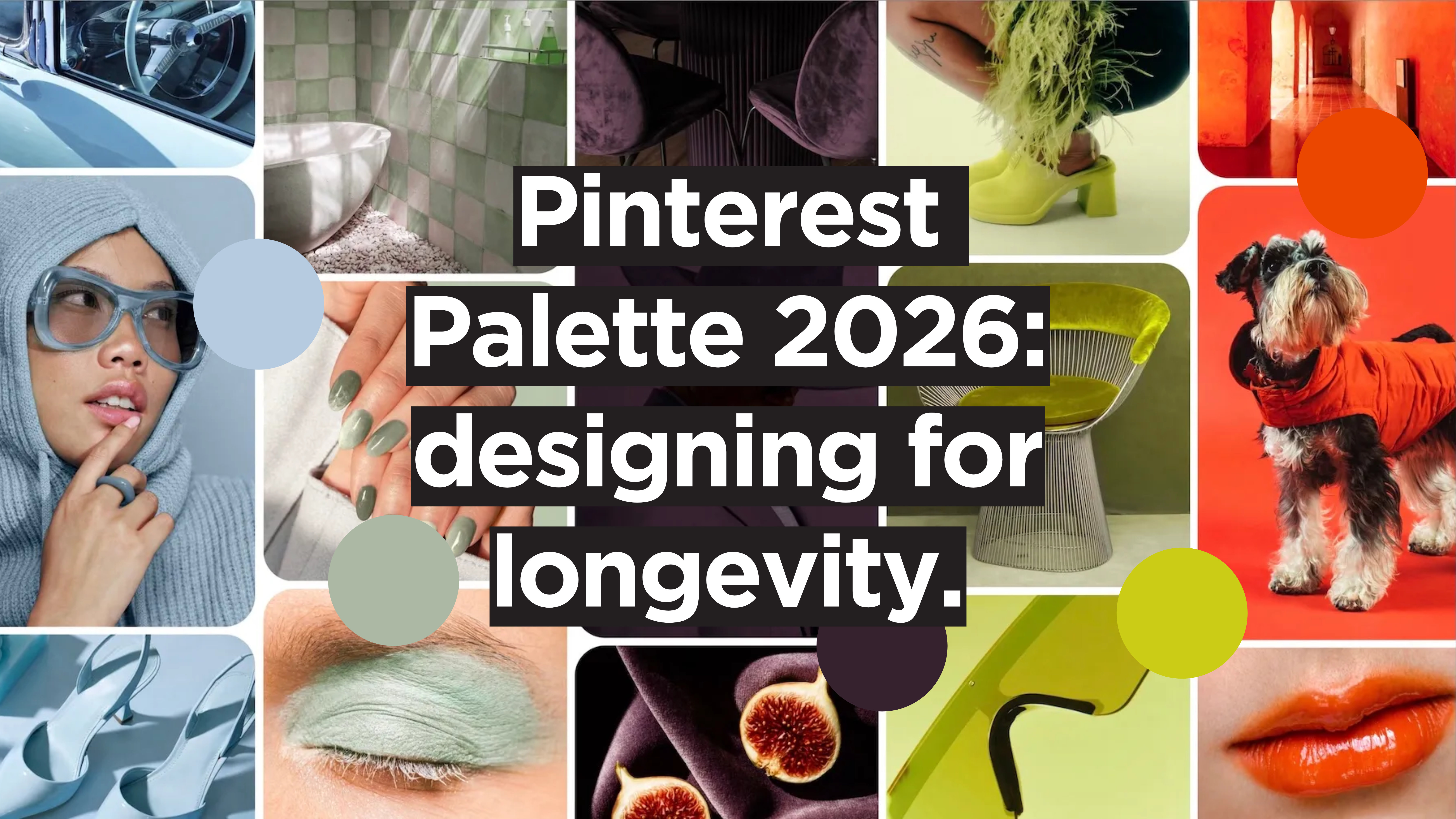
Meet the 2026 Pinterest Palette
For the past two years, along with their Pinterest Predicts report, the platform has been releasing a palette of five colours inspired by the trends featured in their predictions. The purpose of the Pinterest Palette is the same as Pinterest Predicts: spotlight the next big thing based on Pinterest’s user data. In short, Pinterest does bottom-up trend forecasting — where the trends aren’t picked by a group of experts in a boardroom, but by analysing real-world behaviour.
For 2024 it was Desert Orange, Gummy Pink, Aqua Blue, Moss Green and Mocha Brown. For 2025 — Cherry Red, Butter Yellow, Aura Indigo, Dill Green, and Alpine Oat. And for 2026? Meet this year’s Pinterest Palette.
Cool Blue
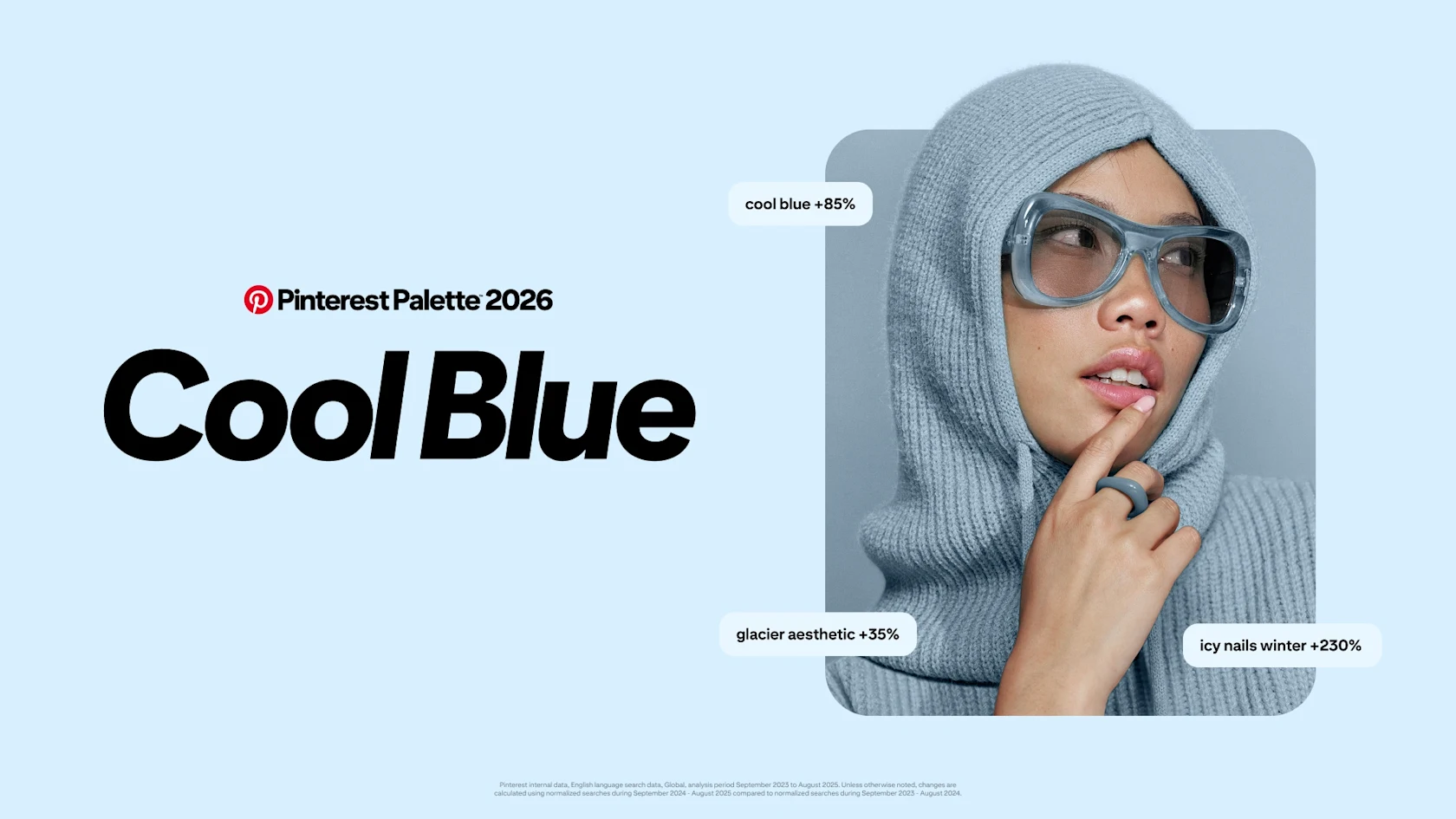
The first shade in Pinterest’s 2026 palette is Cool Blue, an icy, crystal-clear blue, ideal for fintech, product UI, and minimalist websites. On Pinterest, the top searches related to Cool Blue are "glacier aesthetic" (+35%), "cool blue" (+85%), and "icy winter nails" (+230%).
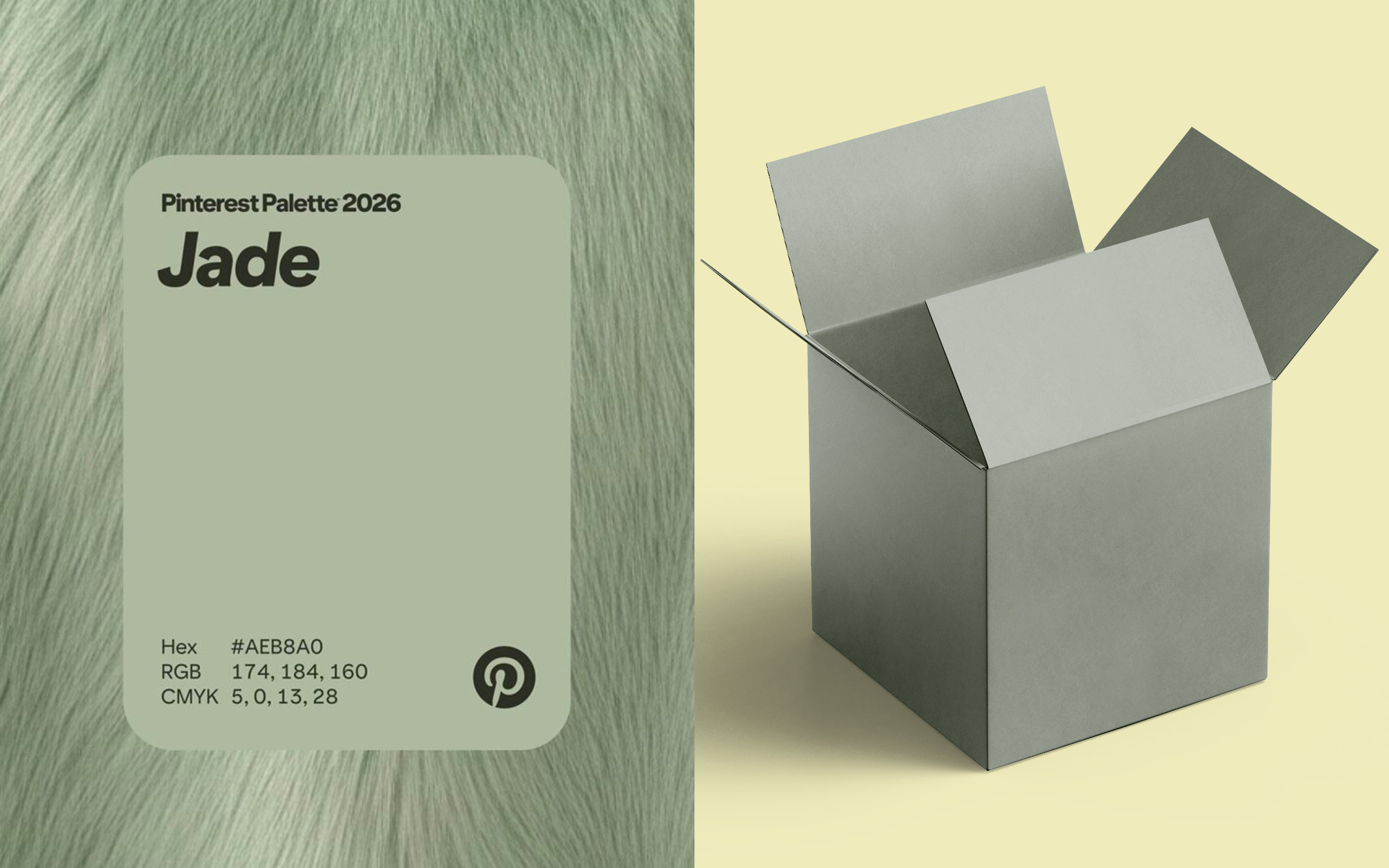
Jade
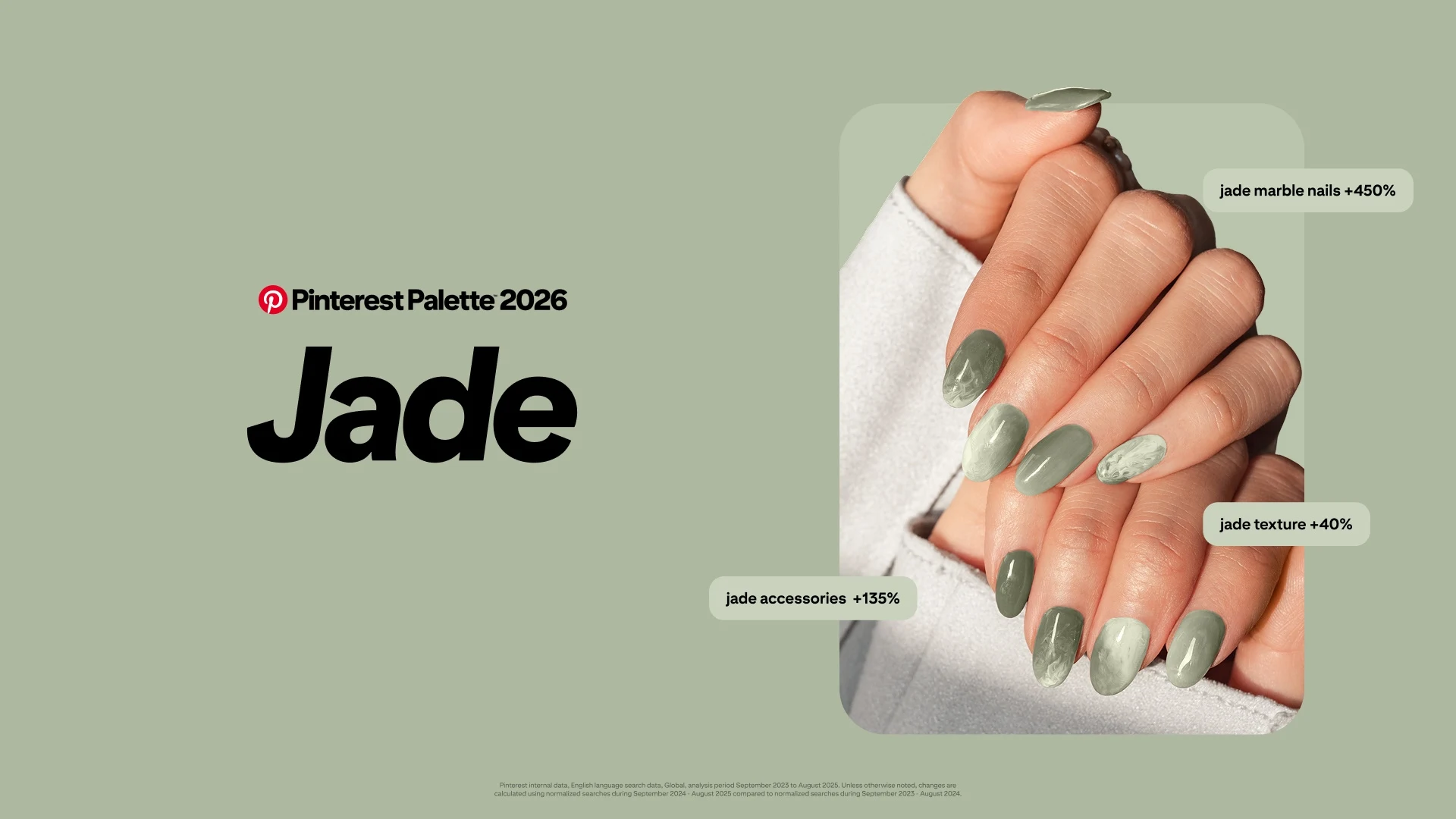
Earthy and calming, Jade is trending both as a colour and a material. In the fashion and beauty space, the natural marbled texture of Jade is a must: searches for "jade marble nails", "jade accessories", and "jade texture" have increased by +450%, +135%, and +40% respectively. In design, Jade suits wellness, lifestyle, and premium consumer brands.
Plum Noir
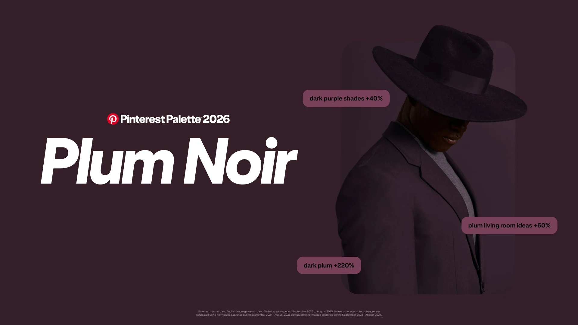
There’s nothing like a deep purple with burgundy notes to evoke emotion visually. These purple-red-brown shades are having a real moment this year: searches for "dark plum" are up +220%, "deep burgundy" is up +230%, and "dark purple shades" has rackedup a +40% increase. Pinterest highlights Plum Noir as their 2026 hero dark neutral — a moody, suave, and dramatic shade perfect for luxury branding, editorial sites, and “dark mode” palettes.
Wasabi
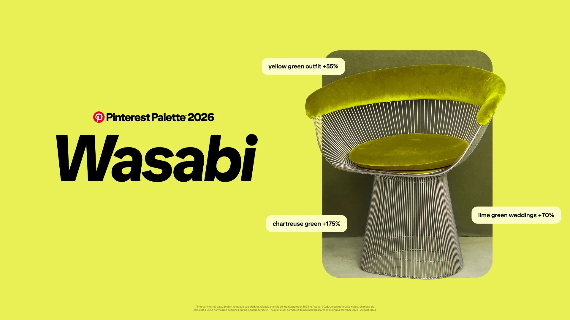
The muted, mossy Jade isn’t the only green featured in this year’s Pinterest Palette. Wasabi is an electric chartreuse that has been showing up in wedding ("lime green weddings" +70%) and fashion ("yellow green outfits" +55%) inspo moodboards. In design, Wasabi is perfect for accents: calls to action, product drops, and standout moments.
Persimmon
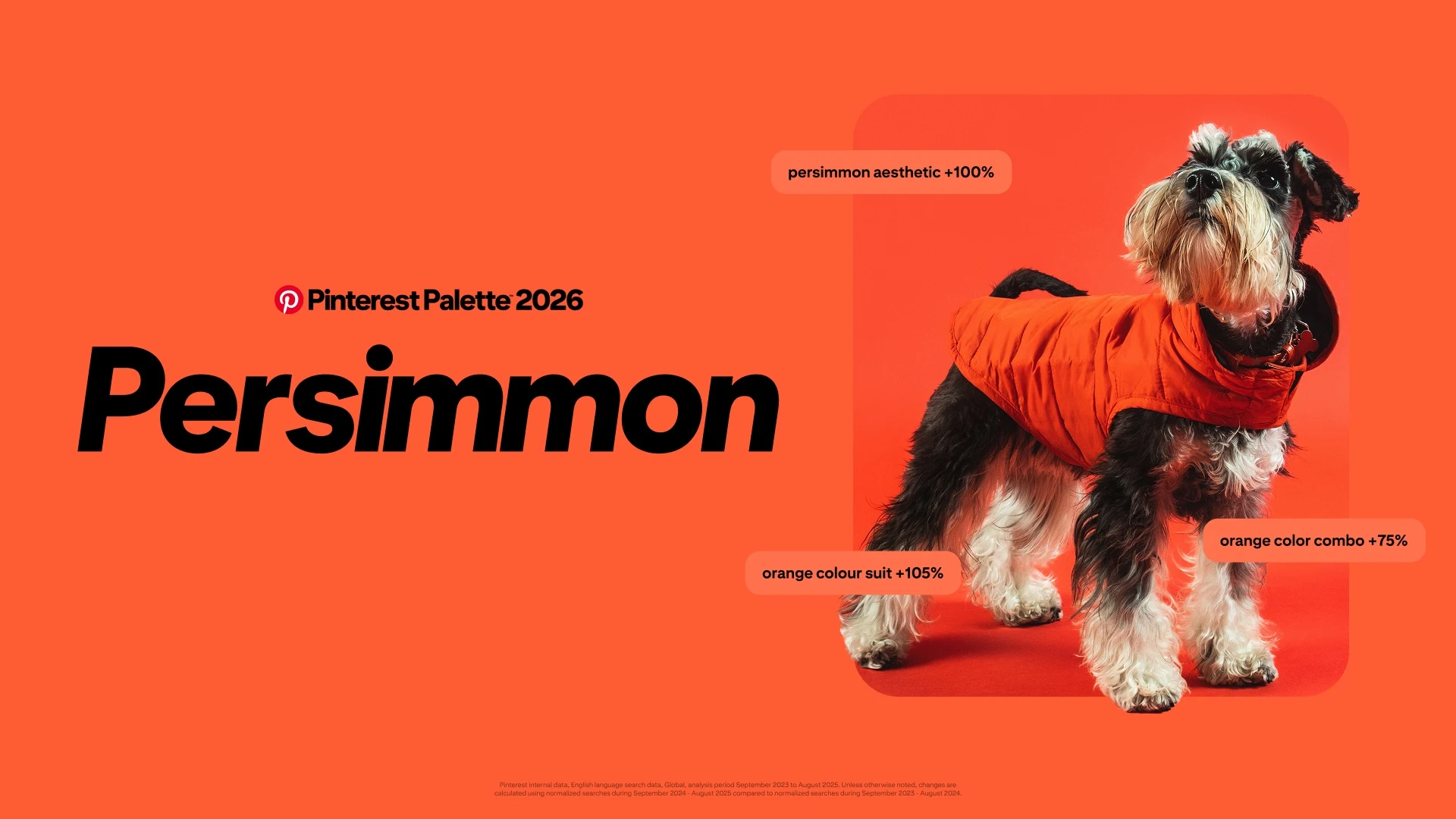
Last but not least, the warm hue to end all warm hues: punchy Persimmon is a reddish orange bringing the heat — and the joy. "Orange colour suit" (+105%), "persimmon aesthetic" (+100%), and "orange colour combinations" (+75%) are the search trends identified by Pinterest. Persimmon is best for headline typography, campaign highlights, and launches.
The Problem with the Pinterest Palette
Here’s where the problems start. While the past two iterations of the Pinterest Palette featured standard colours and clear values, the 2026 edition offers a spectrum of shades. For example, Cool Blue can range from glacier to sky blue. A spectrum might work on a moodboard, but when designing a brand or sending an item to print, the information needs to be more specific. You might’ve noticed that Pinterest still provides HEX codes and RGB and CMYK values: those refer to the median value, an “average” colour somewhere in the middle of the spectrum. As Brand Strategist Mariya Vasileva points out, these HEX often fail accessibility or print standards: for example, Cool Blue is too light for structural UI, while if printed on uncoated cardstock, a dusty green like Jade would lose all saturation and end up looking like “wet cardboard”.
Why “Vibe Branding” Fails
Everywhere on social media the Pinterest Palette is talked about as a designer’s dream: perfect for new products, packaging, websites, or campaign creatives, capable of tapping into your customer’s emotions. Just pick your favourite, and a stunning, memorable brand will follow.
In her YouTube video The Problem with Pinterest 2026: Why “Jade” Prints Like Wet Cardboard, Vasileva makes a case against what we’ll call “vibe branding”: creating designs, collaterals, and brands based on trends, abstract moodboards, and colour spectrums — much like this year’s Pinterest Palette. Vasileva’s design practice follows an architectural system, where a brand is seen as an “operational asset”, not a “surface.” To her, the Pinterest Palette should be the starting point of an exploration on colour, brand identity, and longevity, not a pre-packaged, finished system ready for the market.
Vibe branding is, by nature, trend-led and short-lived. After all, a vibe is just that: a moment, a passing sensation. A brand built on the five trendiest colours of the moment can become obsolete literally overnight, as such is the nature of trends.
Brand Colours for Longevity
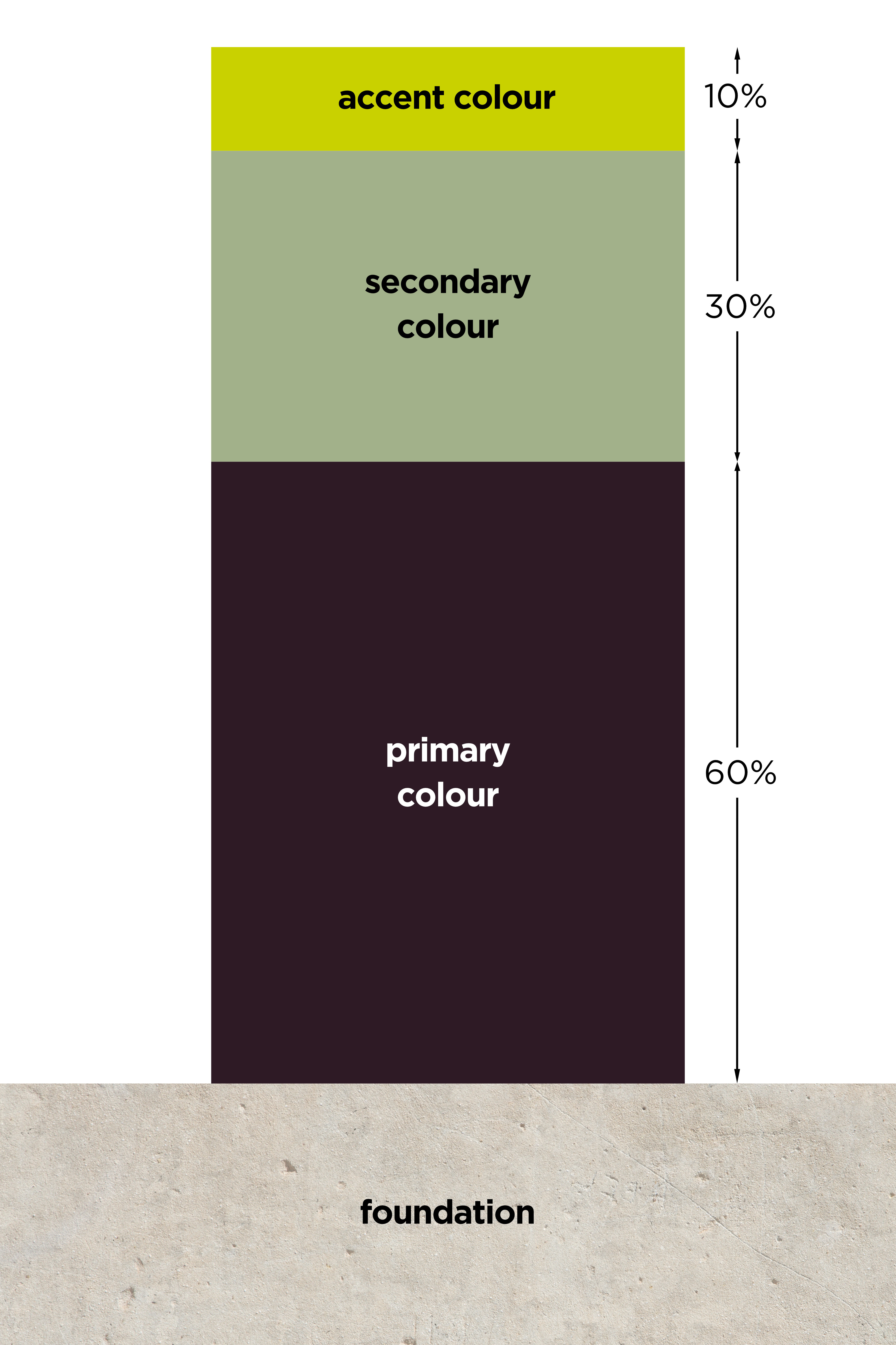
This doesn’t mean trends should always be avoided at all costs; it means they must be adopted wisely and in a “controlled” manner. For example, bold and punchy colours like Wasabi and Persimmon could make fantastic accent shades — in the right brand and paired correctly —, but basing your entire brand identity on them might make it look dated in six months. Following a structure of:
- Foundation Colour — a neutral colour to help the bold hues “land”. This year's Pinterest Palette doesn't offer a proper neutral like 2024's Mocha Brown and 2025's Alpine Oat, so it's up to you or your design team to find the right one.
- Primary Colour — the soul of your brand, taking up 60% of the space. Cool Blue, Jade, and Plum Noir can make great Primary Colours.
- Secondary Colour — taking up 30% of the real estate, it complements and stabilises the Primary Colour. Plum Noir can also function as a Secondary Colour when paired with a lighter shade like Cool Blue.
- Accent Colour — the pop of brightness: eye-catching and perfect moments of emphasis like calls to action and highlights. To be used sporadically, only 10% of the time. As mentioned, Wasabi and Persimmon perfectly suit this role.
Ensures that the trend scales with your brand instead of holding it back.
Another key factor of brand longevity is consistency. Your brand colours should look the same everywhere, on every medium: on a phone screen, printed on cardboard, embroidered on a t-shirt, and so on. That’s what Pantone Colour Codes are for: unique, globally standardised identifiers within the Pantone Matching System (PMS) that ensure precise colour coherence across printing, fashion, manufacturing, and graphic design.
Pinterest does not provide Pantone Colour Codes for their Palette, but luckily Vasileva has done the hard work for us in her Evergreen Colour Workbook, where she provides fixed HEX codes and Pantone Colour Codes for this year’s five hottest shades.
Trendy or Timeless?
Can Pinterest’s colour trend forecast have a place in your design practice and brand identity? For sure, but only as a starting point; a launching pad for a more profound analysis. The balance between trendiness and longevity is a tough one to crack, but a sturdy design system can help.