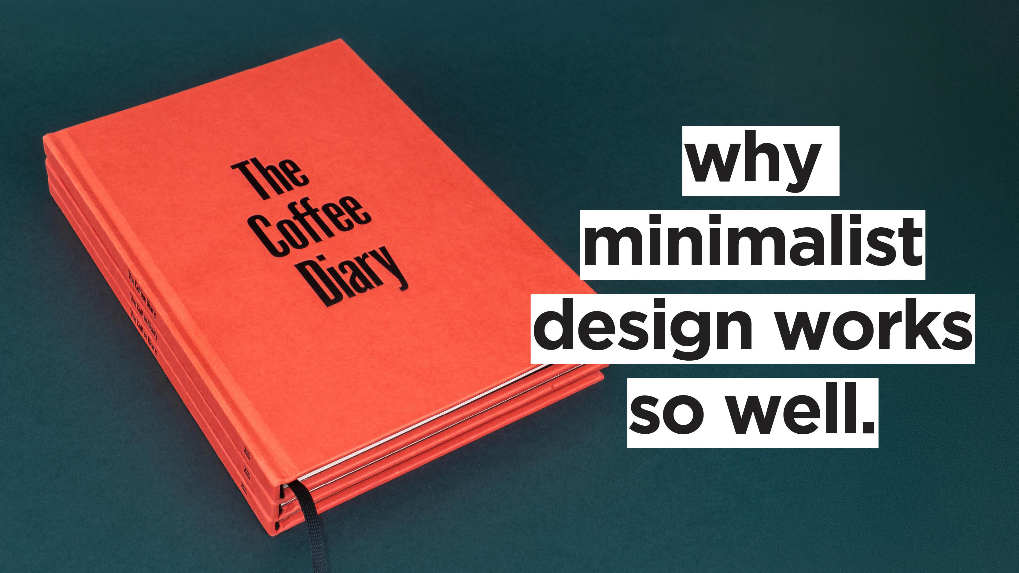
In a world full of overwhelming sensory input, minimalist design can be a breath of fresh air. Elegant and impactful, minimalism is all about the “less-is-more” philosophy: by removing unnecessary clutter, clarity and functionality take centre stage.
Minimalism as a visual arts movement first gained popularity in the 1950s and 1960s in New York City, quickly expanding to other countries and disciplines (like design and architecture).
In 2026, it still resonates with brands and creatives alike, both as an aesthetic philosophy and as a commercial strategy.
But why? What makes minimalism so effective?
What Is Minimalism, Really?
Before answering that, it’s useful to define what minimalism really is.
As a design style, minimalism emphasises clean lines, ample white space, and restrained use of colour and typography. Treating it as a surface-level aesthetic, though, would be a mistake: true minimalism starts with thinking.
The key to understanding minimalism is the assumption that visual simplicity doesn’t automatically create clarity. Minimalism is about stripping back first conceptually, then designing. Functionality is another key ingredient: everything that appears on the page (or website, packaging, building, garment…) must be useful and, at the same time, nothing truly useful should be removed for simplicity’s sake.
At its core, minimalist design is about respect and consideration for the user.
The Principles of Minimalist Design
Minimalist design follows a few key principles:
- Simplicity: Clean and uncluttered layouts are preferred over complex ones.
- Hierarchy: Clear hierarchy (especially in typography) ensures that important elements stand out and promotes information retention.
- Whitespace: Also known as negative space, whitespace is a key tenet of minimalism, promoting readability and giving designs room to “breathe”.
- Typography: Minimalist typography is clean and legible, focusing on sans-serif fonts and limited variation. As mentioned, a clear hierarchy of fonts, weights, and sizes is a must.
- Colour: Minimalist colour palettes are often limited to a few hues (usually neutrals) and include a single accent colour.
Why Minimalist Design Works So Well
Even after years of maximalist trends and “dopamine design”, minimalism keeps delivering: Swiss Graphic Design from the 50s is so effective that it still inspires designers and creatives everywhere. Here are five (science-backed!) reasons why.
1. Purposeful Reduction Removes Obstacles
At its best, minimalism simplifies in the service of meaning. Through “purposeful reduction”, minimalist design removes what gets in the way of information retention and user experience.
2. It Reduces Cognitive Load
How much information can your brain handle? Actually… not a lot. Our working memories, which oversee processing information, are severely limited.
According to educational psychologist John Sweller’s Cognitive Load Theory, there are three kinds of load on our working memory:
- Intrinsic load: The inherent difficulty of the content itself (e.g., learning a new language vs. counting to 10).
- Extraneous load: The mental load wasted on poorly worded instructions, confusing design, or unnecessary distractions. This effort is wasted as it doesn’t add value to learning.
- Germane load: The useful effort of building understanding, processing,and storing information into long-term memory structures called schemas.
Designers directly control the extraneous load: every unnecessary and distracting animation, gradient, pop-up, and visual element actively reduces capacity for information retention.
A minimalist design, on the other hand, features only what the user needs to understand and process the intrinsic load, making the information presented immediately more accessible.
3. Hick’s Law of Reaction Time
Hick’s Law states that reaction time increases logarithmically with the number of choices presented — meaning that more options = longer decision time.
This directly influences interface design: in a minimalist interface, each page has one clear primary action and as few simultaneous actions as possible. This reduces reaction time, because the call to action is clear.
4. Processing Fluency: Easy to Read Means Easy to Trust
Research by Reber, Schwarz, and Winkielman established that stimuli processed more easily are perceived as more aesthetically pleasing, truthful, and trustworthy.
This is known as processing fluency, and it can be aided by adopting minimalist design principles: high-contrast text, predictable layouts, and familiar patterns.
5. Minimalism As a Response to AI
In the age of AI-generated everything, cluttered social media feeds, and a seemingly endless cacophony of ads, brands that adopt minimalism as a philosophy rather than a trend stand out as confident (and convert more). LinkedIn’s 2025 design analysis confirms this, proving that work characterised by "clarity, structure and functionality" consistently outperforms expectations.
Common Minimalism Mistakes
Whether you adopt minimalism as a brand philosophy or as a marketing strategy to cut through the noise, you just have to do it right. Avoiding these mistakes is key.
Minimalism Without Purpose
Removing elements to look “clean” is not minimalism — removing elements that don’t serve the user is. Even worse is when deleting a label, a border, or a navigation item makes the interface harder to use. In minimalist design, form always follows function.
Ignoring Hierarchies
In the same vein, an interface with no visual or type hierarchy is as hard to navigate as the most cluttered one: you’re just trading a confusing hodgepodge for a blank wall. Size, weight, contrast, and spacing help the user by showing them exactly where to look first, second, and third.
Aesthetics That Hinder Function
Lastly, keep legibility top of mind. Some design choices (low contrast between text and background, ultra-fine fonts, muted palettes…) can look chic, but fall apart once the user finds themselves in less-than-optimal lighting conditions.
How To Apply Minimalism in Your Design Work
Have you been converted into a minimalism lover yet? If the look and philosophy resonate, here are a few tips for incorporating minimalism in your own design work — the right way.
- Grids create predictability, and predictability helps understanding. Establish a grid and stick to it throughout your entire design.
- Choose one font and establish hierarchy through size and weight alone for a true 1950s approach.
- Define a spacing scale and use it consistently.
- Question every element carefully. Does it help the user understand? Does it help them act? No? Then it has to go.
- Ensure legibility: don’t forsake high contrast, adequate font sizes, and sufficient line height for aesthetics.
- Reduce choices so that each screen guides toward one clear action.