After 15 years in the print industry, it’s safe to say that, at Jump, we’ve seen it all. And not only that: we understand that, with each project, the stakes are high.
Mistakes in a print project can be expensive, time-consuming, and frustrating. While we always do our best to avoid mistakes on our end — and will always rectify any that come up —, preventing mishaps is a two-way street.
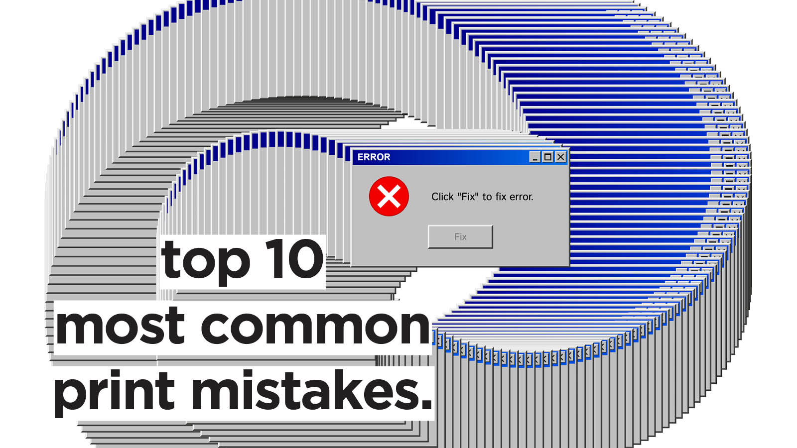
In our experience, there are 10 mistakes that show up again and again in print projects — mistakes that anyone, even the most experienced, can fall victim to. Here are the top 10 most common print mistakes we come across, and tips on how to fix them.
Mistake 1: Forgoing Proofreading
If you think you’ve proofread your document enough times, think again! Typos, grammatical errors, wrong names, and missed spaces are by far the most common print mistakes we come across.
How To Fix It
Word-blindness is real. Always make sure to run your copy through spell-checking software like Grammarly, and to get another member of your team to read through as well. If in doubt about spelling, word usage, or point of grammar — research it. Lastly, don’t forget to check headings, subheadings, and logos: sometimes mistakes can hide in plain sight.
Mistake 2: Wrong Document Size/Format
While it might go without saying, receiving a document in the completely wrong size or format is more common than one might think. A common mistake comes from the difference between A4 and USA A4 (also known as US Letter). US Letter corresponds to UK A4, but is a slightly different size. So, if Word is set to the wrong region, the PDF will also be the wrong size.
How To Fix It
Before jumping to design your print job, take care to select the correct document size: for example, if you’re designing a new business card, remember that the standard size in the UK (and Europe) is 85mm x 55mm.
Then, when it’s time to export, always confirm with your printer what their preferred file format is. PDF is the standard for multi-page documents.
Mistake 3: Wrong Colour Mode
The difference between RGB and CMYK colour modes is, without a doubt, one of the most confusing aspects of print and design. The golden rule is: RGB is for digital designs, while CMYK is for print. While the two colour modes can look the same on screen, they are made up of different shades, so some hues present in RGB might not look the same in CMYK.
How To Fix It
Graphic design software like Photoshop and Canva allow you to set a document’s colour mode. You can design your project in RGB and, before saving, switch to CMYK to see how it all looks. This process is known as soft proofing. Otherwise, you can change colour modes before diving into the designing process, too.
Mistake 4: Black Not Actually Being Black
Choosing the incorrect colour mode, or using RGB images, can result in all four colours printing together to create "black." This can cause elements to look "fuzzy” because they consist of four layers rather than just black alone. Because of this, artwork marked as "black only" isn't actually black. This mainly applies to text and logos and is different from when you want to achieve a rich, solid black. We recommend C:40 M:30 Y:30 K:100 for this.
How To Fix It
To prevent this, always double-check your colours before output. Adobe software like Illustrator, InDesign, and Acrobat Pro allow you to check the composition of your colours. By turning off the “black” channel, you can see if any items are set up incorrectly.
Mistake 5: Using Low-Resolution Images
There’s nothing worse than spending time and money on a print project only for the result to be painfully low-res. Low-resolution images and graphics not only will result in a blurry and pixelated result, but also cheapen your project altogether.
How To Fix It
Make sure that all your graphics and images are at least 300 dpi (“dots per inch”, the number of individual dots that can be placed in a line within a span of one inch). You can easily check your visuals’ dpi with software like Photoshop and InDesign, or even simply on your Mac or Windows computer.
This is especially important for small products, such as business cards, flyers, and booklets. For larger-scale projects like banners and flags, on the other hand, a resolution as low as 150 dpi will do.
Mistake 6: Font Issues
During the printing process, even your fonts can cause issues! These are usually two: the font is missing or the font size is too small. A missing font will usually be detected by the print software and, in rare cases, substituted, resulting in a completely different design. Very small text, on the other hand, will be hard to read.
How To Fix It
To ensure your chosen font remains in the design, remember to embed your chosen fonts into the print-ready PDF, so your printer can access them. Alternatively, you can rasterise the file in Photoshop or convert your text to outlines in Illustrator.
When it comes to font size, on the other hand, try to stay above the 6pt size for readability.
Mistake 7: Not Including Bleed
If your project features a background or design features that extend to the edge of the page, setting a bleed is fundamental. The bleed is the part of a printed document that goes beyond the edge of the page after trimming. If you don’t set a bleed for your artwork, the guillotine used to trim print jobs might leave an unsightly thin white border.
How To Fix It
Even though guillotines have become way more precise, it’s still good practice to set a bleed to avoid cutting mishaps. At Jump, we recommend you leave a 3mm bleed.
Mistake 8: Spot Colours Not Set Up Correctly
As opposed to CMYK printing, spot colour printing allows for more vibrant, consistent results and more accurate shades. The downside is, the spot colours need to be set correctly. The price to pay for incorrectly set spot colours is duller or simply incorrect colours.
How To Fix It
To set up spot colours for print correctly, create named spot colour swatches in your design software (like Illustrator or InDesign), select the appropriate colour type, and export the file with colour separations enabled for your printer. It’s best to use a consistent colour system, such as Pantone Matching System (PMS), to make sure that the spot colour name matches. Lastly, don’t forget to check for overprint issues using the Overprint Preview feature before printing.
Mistake 9: Cutter Guides and Special Objects Not Set Up As Spot Colours
Spot colours can also help if your project features cutter guides or other special objects. Otherwise, the special objects will be converted to CMYK process colours and printed as part of the final artwork.
How To Fix It
Special objects can be set as spot colours in vector-based design software like InDesign and Illustrator. To do this, you’ll have to create a new swatch in your software and assign it to the vector path of your guide.
Mistake 10: Ignoring Safe Zones
Safe zones serve the same purpose as bleed areas, but inside your project. There is always the possibility of the paper moving in the cutting machine: while the blade can trim outside the cutting marks, it can cut inside as well.
How To Fix It
Allow a bit of margin within your working area, and avoid placing text and images beyond that margin. At Jump, we ask for a 5mm safe zone. For books and booklets, the safe zone will need to be wider in the area where the spine is located.
Email us at hello@wearejump.co.uk to receive a quote on your next print project today!